

Microsoft Excel is one of the most popular and powerful tools for working with data. It’s not just a spreadsheet program—it allows you to organize, clean, analyze, and visualize data all in one place. Whether you are a student, business professional, or beginner, learning how to use Excel for data analysis can help you make smarter, data-driven decisions
Excel is widely used across industries because it is accessible, versatile, and packed with features like formulas, pivot tables, charts, and conditional formatting. Even beginners can start with simple steps to explore trends, summarize information, and draw meaningful insights from data
In this guide, you will learn step by step how to use Excel for data analysis. You’ll discover how to organize your data, clean it for accuracy, apply formulas, create pivot tables, visualize information with charts, and analyze trends effectively. By the end of this article, you’ll be confident using Excel to transform raw data into actionable insights that are easy to understand and share
Why Use Excel for Data Analysis? (Expanded Version)
Excel is more than just a spreadsheet tool—it is a powerful platform for analyzing, visualizing, and understanding data. Learning how to use Excel for data analysis allows beginners and professionals alike to transform raw numbers into actionable insights that support smarter decisions
1. Widely Available and Easy to Use
One of the biggest advantages of Excel is that it is readily available on most computers and workplaces. You don’t need to install complex software or learn programming to start analyzing data. Beginners can start with basic features like formulas, sorting, and simple charts, making Excel a perfect starting point for data analysis
2. Powerful Analytical Tools
Excel comes with a variety of built-in tools that make data analysis efficient:
- Formulas such as SUM, AVERAGE, COUNT, IF, and VLOOKUP allow quick calculations and conditional analysis
- Pivot Tables help summarize large datasets and view them from different perspectives
- Conditional Formatting highlights key trends, patterns, or outliers instantly
These tools give you the ability to analyze data without writing code or using advanced software
3. Flexible and Versatile
Excel is used in many industries, from business and finance to marketing, research, and education. It can handle financial reports, sales tracking, survey analysis, budget monitoring, and much more. This flexibility makes it an essential skill for students, professionals, and entrepreneurs
4. Visual Insights Made Easy
Visualizing data is critical to understanding patterns and trends. Excel allows you to create bar charts, line charts, pie charts, and scatter plots with just a few clicks. These visuals help communicate your findings clearly to colleagues, clients, or stakeholders
5. Efficient Data Cleaning and Organization
Before analyzing data, it must be clean and organized. Excel provides tools like sorting, filtering, removing duplicates, and formatting options, which make it easy to prepare your dataset. Clean data ensures accurate results and reliable insights
6. Supports Better Decision-Making
By summarizing data in tables, charts, and dashboards, Excel allows you to make informed, data-driven decisions. Whether you are tracking sales, monitoring expenses, or analyzing trends, Excel helps you quickly see the bigger picture how to use excel for data analysis
7. Beginner-Friendly Learning Curve
Excel is suitable for beginners because you can start with simple tasks and gradually explore advanced features. You can learn basic formulas first, then move on to pivot tables, charts, and advanced functions, making it a practical tool for continuous learning
In short, Excel is a complete tool for data analysis. It is accessible, versatile, beginner-friendly, and powerful enough to handle complex datasets. Mastering Excel not only helps you understand data better but also builds essential skills for professional growth in any field how to use excel for data analysis
you may also like to read these posts;
Product Growth Analytics Tools: Boost Engagement & Revenue
How to Build a Data Driven Growth Strategy
Marketing Performance Analytics Guide for Beginners
Customer Growth Data Analysis: Track, Analyze, Grow
Growth Analytics for Startups: Key Metrics & Tools
Step by Step Guide to Use Excel for Data Analysis

Using Excel for data analysis becomes easy if you follow a structured approach. Here’s a step-by-step guide to help beginners work with data efficiently and extract meaningful insights
Step 1: Organize Your Data
Start by importing or entering your dataset into Excel. Use clear column headers that describe the data, such as “Date,” “Sales,” or “Product.” Keep formatting consistent across rows and columns and remove blank rows, unnecessary spaces, or irrelevant information to prepare a clean dataset how to use excel for data analysis
Tip: Always save a copy of your original data before making changes
Step 2: Clean Your Data
Use Text to Columns to split combined data into separate columns. Apply Find & Replace to correct errors or standardize entries. Remove duplicates using Remove Duplicates under the Data tab. Check for missing or inconsistent values and fill or correct them
Tip: Clean data ensures accurate analysis and reliable results how to use excel for data analysis
Step 3: Use Formulas for Analysis
Excel formulas allow you to calculate, summarize, and analyze data efficiently. SUM() adds numbers, AVERAGE() finds the mean, COUNT() / COUNTA() counts numbers or non-empty cells, IF() applies conditional logic, VLOOKUP() / XLOOKUP() finds values across tables, and TEXT() formats dates, numbers, or text how to use excel for data analysis
Tip: Start with simple formulas, then explore advanced ones like SUMIFS, COUNTIFS, and INDEX-MATCH for deeper analysis
Step 4: Sort and Filter Data
Use Sort to arrange data in ascending or descending order and Filter to focus on specific rows based on criteria. This helps in spotting trends, top-performing items, or subsets of data quickly
Example: Filter sales data to show only products with revenue over $5000 how to use excel for data analysis
Step 5: Create Pivot Tables
Pivot tables summarize large datasets without complex formulas. Drag fields into Rows, Columns, and Values to explore different views. Quickly calculate totals, averages, counts, and percentages. Use Pivot Charts to visualize summarized data
Example: Analyze monthly sales by product category using a pivot table how to use excel for data analysis
Step 6: Apply Conditional Formatting
Highlight key insights using colors, data bars, or icons. Conditional formatting helps identify trends, patterns, or outliers instantly and makes analysis more visual
Example: Highlight all sales above $1000 in green and below $500 in red how to use excel for data analysis
Step 7: Visualize Data with Charts
Bar and Column Charts: Compare categories or groups. Line Charts: Show trends over time. Pie Charts: Show proportions of a whole. Scatter Plots: Identify relationships between two variables. Choose the chart type that best represents your data and insights
Tip: Keep charts simple and label axes clearly to communicate your message effectively how to use excel for data analysis
Step 8: Analyze Trends and Insights
Review pivot tables, formulas, and charts to spot patterns. Identify peaks, drops, and anomalies in your data and draw actionable insights to make data-driven decisions
Example: Monthly sales line chart shows a peak in December, indicating holiday season demand how to use excel for data analysis
Step 9: Practice Regularly
Work on sample datasets to improve skills. Experiment with formulas, pivot tables, and charts. Analyze your own business, school, or personal data for real-world experience
Tip: The more you practice, the faster and more confident you will become in using Excel for analysis how to use excel for data analysis
Real-Life Examples / Mini Case Studies – Using Excel for Data Analysis
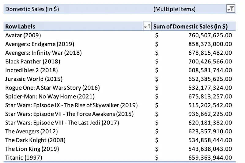
Real-life examples help beginners understand how Excel can be used to analyze data and make decisions
Example 1: Sales Analysis for a Small Business
Scenario: A small business wants to track monthly sales by product
Steps: Organize data with columns for Product, Month, and Sales. Use a pivot table to summarize sales by product and month. Apply conditional formatting to highlight top-performing products. Create a line chart to visualize monthly trends how to use excel for data analysis
Insights: T-shirts sell most in summer, jackets in winter. The business adjusts inventory and marketing campaigns accordingly
Lesson: Pivot tables and charts make it easy to summarize and interpret sales data
Example 2: Social Media Engagement Analysis
Scenario: A social media manager wants to analyze engagement across platforms
Steps: Collect likes, shares, and comments on Facebook, Instagram, and Twitter. Create a pivot table to summarize engagement. Use a pie chart to show proportion of engagement per platform how to use excel for data analysis
Insights: Instagram has the highest engagement, Twitter is lower. Content strategy focuses more on Instagram
Lesson: Excel visualizations help identify which platforms perform best and guide strategy
Example 3: Budget Tracking and Expense Analysis
Scenario: An individual wants to track monthly expenses
Steps: Organize expenses by Category, Date, and Amount. Use SUM() formulas to calculate total expenses per category. Apply conditional formatting to highlight overspending. Create a bar chart to compare category spending how to use excel for data analysis
Insights: Food and entertainment have the highest expenses. Budget adjustments can be planned accordingly
Lesson: Excel helps manage personal finances and identify areas to save
Key Takeaways from Case Studies:
- Use pivot tables, formulas, and charts to summarize and visualize data
- Highlight trends, patterns, and outliers for actionable insights how to use excel for data analysis
- Even small datasets benefit from Excel analysis to make better decisions
How can I improve my Excel data analysis skills?
Practice regularly with sample or real datasets, explore formulas, pivot tables, and charts, learn shortcut keys, and study professional examples to improve accuracy and efficiency
What are common mistakes to avoid in Excel data analysis?
Skipping data cleaning before analysis
Using inconsistent formatting
Overcomplicating formulas unnecessarily
Choosing the wrong chart type for your data
Ignoring patterns and trends in visualizations
Can Excel be used for business and personal projects?
Yes, Excel is versatile. It can be used for business reporting, sales analysis, social media tracking, research, budgeting, and personal finance management
Conclusion
Excel is a powerful and beginner-friendly tool that makes data analysis accessible to everyone. By learning how to organize, clean, and analyze data in Excel, you can turn raw numbers into meaningful insights that support smarter decisions. From simple formulas to pivot tables and charts, Excel provides everything you need to explore and understand your data effectively
Following a step-by-step approach makes the process much easier. Start by organizing and cleaning your data, then use formulas, sorting, and filtering to analyze it. Finally, create pivot tables and charts to visualize patterns and trends. These techniques help transform complex datasets into clear and useful information how to use excel for data analysis
Whether you are analyzing business data, tracking personal finances, or studying trends for research, Excel offers the flexibility and tools to handle many types of data tasks. With regular practice and experimentation, you can gradually build stronger data analysis skills and become more confident in using Excel for real-world projects
Learning how to use Excel for data analysis is an important skill in today’s data-driven world. The more you practice and explore its features, the more value you will gain from your data and the better decisions you will be able to make in your work and daily life.


