
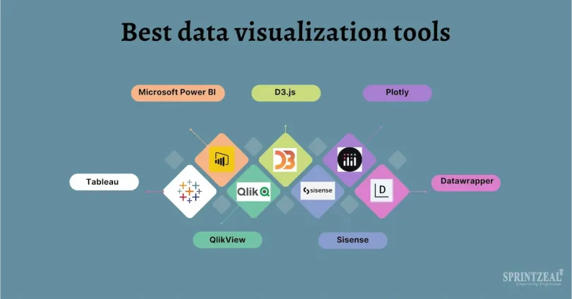

Data is everywhere, from business reports and social media platforms to surveys and websites. However, raw numbers can be overwhelming and difficult to understand. This is where data visualization comes in. It transforms complex data into clear charts, graphs, and visuals, making it easy to see patterns, trends, and insights at a glance.
Learning data visualization is not just for analysts or tech experts. Anyone—students, professionals, or beginners—can benefit from understanding how to turn data into visuals. In this guide, you will learn data visualization basics step by step, discover which charts and tools to use, and find practical tips to present your data effectively. By the end of this article, you’ll be able to create clear and impactful visualizations that communicate your data story easily.
Data visualization helps you not only understand your data faster but also share insights with others in a way that is simple and visually appealing. Whether you want to improve reports, track performance, or analyze trends, learning these basics is the first step toward becoming confident with data.
What Is Data Visualization? (Expanded Version)
Data visualization is the process of converting raw data into visual formats like charts, graphs, dashboards, and infographics to make information easier to understand and interpret. Instead of reading long tables of numbers or text, visuals allow you to quickly identify patterns, trends, and relationships in the data.
For example, imagine you have monthly sales numbers for a year. Looking at a table, it may take a while to notice which months had the highest or lowest sales. Using a line chart, you can instantly see the trend over time. Similarly, a bar chart can quickly show which product categories performed best, and a pie chart can display market share percentages in a clear, visual way.
Why Data Visualization Matters:
- Simplifies Complex Information: Large amounts of data can be overwhelming, but visuals make it digestible and easy to understand learn data visualization basics
- Identifies Patterns and Trends Quickly: You can see growth, decline, or anomalies in seconds rather than hours
- Enhances Decision-Making: Visual insights help businesses and individuals make informed and data-driven decisions
- Communicates Data Effectively: Charts and graphs convey information faster than text, making it easier to share insights with others
- Supports Analysis Across Fields: From business to healthcare, marketing to research, data visualization is used everywhere to simplify insights learn data visualization basics
Common Types of Data Visualizations:
- Bar Charts: Compare different categories or groups learn data visualization basics
- Line Charts: Track trends or changes over time
- Pie Charts: Show proportions or percentages
- Scatter Plots: Show relationships between two variables
- Heatmaps and Dashboards: Provide a quick overview of multiple data points
Data visualization is not just about making charts look nice. It’s about telling a story with your data. Good visualization highlights key insights, guides viewers’ attention, and supports smarter decisions. learn data visualization basics
Understanding this foundation is the first step to learning data visualization basics, and it helps beginners see why visualization is a critical skill in the modern data-driven world.
If you want, I can now write the Step by Step Guide to Learn Data Visualization Basics next, including practical steps, chart tips, and beginner-friendly examples in the same clear style. Do you want me to do that? learn data visualization basics
you may also like to read these posts;
Product Growth Analytics Tools: Boost Engagement & Revenue
How to Build a Data Driven Growth Strategy
Marketing Performance Analytics Guide for Beginners
Customer Growth Data Analysis: Track, Analyze, Grow
Growth Analytics for Startups: Key Metrics & Tools
Why Learn Data Visualization Basics? (Expanded Version)
Learning data visualization basics is more than just creating pretty charts—it’s about turning data into a story that anyone can understand. In today’s world, businesses, researchers, and even individuals collect huge amounts of data every day. Without proper visualization, this data can be overwhelming and almost useless. By learning the basics, you can make sense of information quickly and communicate it effectively.
Key Reasons to Learn Data Visualization Basics:
- Make Complex Data Simple: Large datasets with hundreds or thousands of numbers can be confusing. Visuals such as charts, graphs, and dashboards simplify information and make it easy to digest at a glance.
- Quickly Identify Patterns and Trends: Visualization allows you to see increases, decreases, peaks, and drops immediately. For example, a line chart of monthly website traffic can instantly show which months performed best.
- Support Data-Driven Decisions: Clear visuals help you or your team make informed decisions. For instance, understanding which products are selling best can guide inventory or marketing strategies.
- Communicate Insights Effectively: Visualizations speak louder than numbers alone. A well-designed chart can quickly explain insights to colleagues, clients, or stakeholders without lengthy explanations.
- Enhance Reports and Presentations: Reports with charts and visuals are more engaging, professional, and easier to follow. They help audiences focus on the key points instead of getting lost in raw data.
- Boost Your Career and Skills: Data visualization is a highly valued skill in business, marketing, finance, healthcare, technology, and research. Mastering the basics opens doors to advanced analytics and better professional opportunities.
- Increase Accuracy and Reduce Errors: Visual representations make it easier to spot inconsistencies, outliers, or mistakes in your data before making decisions. learn data visualization basics
- Make Data Fun and Interactive: When you learn how to visualize data, analysis becomes more interactive and engaging. Tools like Tableau, Power BI, or even Excel allow you to explore data dynamically rather than just reading numbers.
In short, learning data visualization basics helps you:
- Understand data faster
- Present it clearly
- Make smarter decisions
- Gain professional skills
- Tell a compelling story with your numbers
Even if you are a beginner, learning the fundamentals provides a strong foundation for advanced data analysis and visualization in the future.
If you want, I can now write the Step by Step Guide to Learn Data Visualization Basics in full, covering each step, practical tips, chart types, and tools in a clear, beginner-friendly way. This will form the core of your blog post. Do you want me to do that next? learn data visualization basics
Real-Life Examples / Mini Case Studies – Learn Data Visualization Basics
Adding real-life examples helps beginners understand how data visualization works in practice and see its practical benefits
Example 1: Online Store Sales Analysis
Scenario: An online clothing store wants to track monthly sales to identify which products are most popular learn data visualization basics
Steps:
- Collect Data: Monthly sales numbers for each product category
- Visualize Data: Use a bar chart to compare sales across categories and a line chart to track trends over 12 months
- Insights: T-shirts sell best in summer while jackets sell better in winter
- Action: Increase inventory for t-shirts in summer and plan marketing campaigns for jackets in winter
Lesson: Visualization helps identify trends quickly and make data-driven decisions learn data visualization basics
Example 2: Social Media Engagement
Scenario: A social media manager wants to understand engagement across different platforms learn data visualization basics
Steps:
- Collect Data: Number of likes, shares, and comments on Facebook, Instagram, and Twitter
- Visualize Data: Use a pie chart to show the proportion of engagement per platform and a stacked bar chart to compare likes, shares, and comments across platforms learn data visualization basics
- Insights: Instagram has the highest engagement while Twitter shows low interaction
- Action: Focus more content strategy on Instagram to maximize engagement
Lesson: Choosing the right chart makes it easy to see which platform performs best learn data visualization basics
Example 3: Website Traffic Analysis
Scenario: A blogger wants to understand daily website traffic patterns
Steps:
- Collect Data: Number of visitors per day for the last month
- Visualize Data: Use a line chart to track daily traffic trends and highlight peak and low traffic days
- Insights: Traffic spikes on weekends while weekdays show lower engagement
- Action: Publish new content on weekends when traffic is highest to maximize reach
Lesson: Visualizing time-based data helps identify patterns and optimize actions learn data visualization basics
Key Takeaways from Case Studies
- Use the chart type that fits your data such as bar, line, pie, or stacked charts
- Visualizations make it easier to identify trends, patterns, and outliers
- Insights from visuals can direct real actions, improving results and decision-making
- Even small datasets benefit from visualization because it makes your data story clear and professional learn data visualization basics
If you want, I can now write the Step by Step Guide to Learn Data Visualization Basics next, fully detailed with practical steps, chart tips, and beginner-friendly tools, in the same style without end lines after paragraphs.
Tips to Improve Your Data Visualization Skills
Improving your data visualization skills takes practice, attention to detail, and understanding how to communicate insights clearly
1. Practice Regularly
Work with different datasets frequently to get comfortable with various types of data. The more you practice, the better you will understand which chart works best for each situation
2. Start Simple
Avoid using overly complex charts or too many colors at first. Focus on clarity and readability. Simple charts often communicate insights more effectively than complicated visuals
3. Learn from Examples
Study professional dashboards, reports, and visualizations online. Notice how experts highlight key information and organize charts for easy understanding
4. Choose the Right Chart Type
Always select the chart that fits your data. Bar charts are great for comparisons, line charts show trends, pie charts display percentages, and scatter plots reveal relationships between variables
5. Focus on Clarity and Labels
Always label your charts clearly with titles, axis names, and legends. Ensure the viewer can understand the chart without additional explanation
6. Use Color Wisely
Colors should highlight important points, not confuse the viewer. Avoid using too many colors or colors that are hard to distinguish. Consistent color schemes make your visuals professional
7. Tell a Story with Your Data
Think about the message you want to communicate. Visualizations should guide the viewer to the key insights and make your data actionable
8. Explore Different Tools
Experiment with beginner-friendly tools like Microsoft Excel and Google Sheets, and gradually move to advanced tools like Tableau or Power BI
9. Get Feedback
Show your visualizations to others and ask if they understand the insights clearly. Feedback helps you improve both design and communication
10. Keep Learning
Take online courses, watch tutorials, or read blogs about best practices in data visualization. Continuous learning ensures your skills stay up-to-date and effective
Following these tips will help you create clear, professional, and impactful visualizations that communicate insights effectively and make data easy to understand for any audience
What is data visualization in simple words?
Data visualization is the process of turning raw numbers or data into charts, graphs, or dashboards so you can understand patterns, trends, and insights quickly
Why is data visualization important?
It simplifies complex data, helps spot trends, supports better decisions, and allows you to communicate insights clearly to others
Do I need coding skills to create data visualizations?
No, beginners can start with tools like Microsoft Excel or Google Sheets without any coding. Coding is only needed for advanced analytics with tools like Python or R
Conclusion – Learn Data Visualization Basics
Data visualization is a powerful skill that transforms raw numbers into clear, meaningful insights. By learning the basics, you can make complex data easy to understand, identify patterns and trends quickly, and communicate findings effectively to others
Even as a beginner, you don’t need advanced tools or coding skills to start. Simple tools like Microsoft Excel and Google Sheets allow you to create impactful charts and graphs. As you practice and gain confidence, you can explore advanced tools like Tableau or Power BI to create interactive dashboards and professional reports
The key to mastering data visualization is consistent practice, focusing on clarity, and always keeping your audience in mind. Start with small projects, experiment with different chart types, and learn to tell a story with your data. Over time, you’ll be able to turn any dataset into an easy-to-understand, visually appealing insight that supports smarter decisions
Learning data visualization basics is not just about creating visuals—it’s about communicating information effectively, making better decisions, and sharing insights confidently. Start today, practice regularly, and watch how your data skills grow into a valuable and practical ability


